WORLD IN COLOURS IS MORE BEAUTIFUL
ALL ABOUT COLOURS

The world around us is not black and white. It is beautiful, colorful and it offers itself to us in a multitude of different colours. The human eye can distinguish between at least 2000 different shades of different colours and those also in many different combinations. We use colours and express ourselves with them. They serve as a tool for communication and help us as change the welfare, surroundings ... Using colours we also disclose our spiritual and cultural orientation. We can enrich our world with colours, making it more aesthetic and adjusted to your own needs and desires. It is also good to know something about the colours so that we do not spoil the climate in which we live.
Dr. Anton Trstenjak is considered to be one of the pioneers and leading world experts in the field of importance of colour for human and its interaction with itself and with the surroundings. In the past, people were also aware of the importance of colours and were accordingly using them. Thus, for example, in Asian cultures, colours have had hidden meanings and were supposed to be used in correct proportions and for the exact opportunities, like in trading, ceremonies, stories and other.
Some phylosophies, such as feng shui, strongly emphasize the power of colours and their effect on space and the individual.
Isaac Newton was the first, in 1666, who explained that the colours are derived from the light. Through numerous experiments he found out that the light is constructed from several different colours. When he focused the sunlight through the glass prism, out came a rainbow of seven colours: red, orange, yellow, green, cyan blue, dark blue and violet.
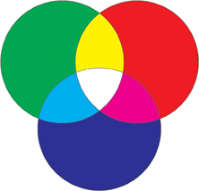
Some time later, Thomas Young discovered that white light consists of only three colours: red, green and blue.
These three colours are therefore original primary colors. When mixed together, white light is created. This is called additive colour mixing.
This principle is used by therapists who heal with colored light or in the theather, where masters for light enlightens the stage.
Later on, Ewald Hering said that the yellow should also be treated as the primary colour, because human eye percieve it as independent, just like red, green and blue. As visual basic primary colours black and white are also included. Today, Hering´s system is the basis for NCS (National Colour System - natural colour system).
There are three basic colours: yellow, red and blue. These are called primary colours.
They are basic because they can not be derrived from other colours. If they are mixed together, they form black.
This is called subtractive colour mixing.
From the original primary colours, mentioned above, they differe in that: we get them by the removal of light.
When we mix together the neigbouring colours the circle, we get secondary colours: orange, violet and green.
And if we mix together the primary and secondary colours, we get tertiary colours: red-violet, red-orange, blue-green, yellow-green, blue-violet and yellow-orange.
Harmonic colours are those, which are the neigbours the colour circle. These are, for example: yellow, lemon yellow, orange-yellow, orange-brown. All 4 of these are originating from the area between yellow and orange, so they fit together nicely.
Complementary colours are those in the color circle, that are lying on the opposite site from one another, and are generating voltage. Yellow is complementary to purple, orange is complementary to blue and green is complementary to red.
Warm colours are red, orange and yellow. Cool colours are blue, green and purple. Neutral colours are white, brown and beige.
We practically never see a single solitary colour, not even if we want to isolate it on purpose. Each has its own colour tone, brightness and saturation, and is more or less under the influence of the colours that surround it, or those that form its background:
- Brightness: colour on a dark background seems to be brighter than on a lighter background.
- Tint: Cyan on a green background looks more blue and on a blue background looks more green.
- Saturation: any colour is greyish on the background of pure clean colour, but if the background is colored in pure, it looks grayish.


COLOURS
Bojan Lisjak http://bojanlisjak.wix.com/all-about-colours e-mail: bojan.lisjak@gmail.com Tel.: 031/567 969
Copyright © 2013 All about colours